
Our analysis of Fortune 1000 software companies shows the average trial or demo form is 60% longer than best-practice benchmarks. Each field beyond five cuts conversions by nearly 7%, inflating CAC and quietly draining pipeline — especially on mobile, where friction is amplified. This article quantifies the hidden “Complexity Tax” created by bloated forms, reveals how even top teams unintentionally cap performance, and outlines high-leverage fixes. Reducing form friction isn’t radical — it’s revenue optimization hiding in plain sight.
The most expensive part of your marketing funnel isn’t your creative, your targeting, or even your ad spend. It’s the 8+ form fields standing between a qualified prospect and a conversion — a silent revenue leak costing Fortune 1000 companies millions in abandoned pipeline every year.
In this first installment from the “Complexity Tax” Series, we’ll quantify the true cost of form complexity, examine how leading enterprises sabotage their own funnels, and share proven ways to reduce friction — all without sacrificing valuable prospect data.
Contents
1. The Hidden Cost of Long Forms: Understanding the “Complexity Tax”
While companies invest heavily in perfecting their messaging, creative, and targeting, most overlook a critical revenue leak hiding in plain sight: the Complexity Tax.
This invisible drain on revenue occurs when high-friction forms drive away the very prospects companies spent thousands to acquire.
When Every Little Field Creates a Bigger Drop-Off
How many fields stand between your prospect and a conversion?
Every additional field isn’t just an extra step. It’s another line item in your Complexity Tax. Each question adds cognitive load, piles on friction, and increases the risk of abandonment from even motivated buyers.
For demand generation leaders, this tax isn’t theoretical. It’s a measurable, compounding drag on pipeline. When companies require 15+ fields just to access a trial or request a demo, they’re not qualifying harder — they’re turning high-intent leads into exits.
Even a single unnecessary field can drop conversions by nearly 7%. Multiply that across thousands of visitors, and hidden friction starts to materialize as real loss: missed targets, inflated CAC, and stalled pipeline.
The Complexity Tax doesn’t show up in your budget, but it drains your pipeline just the same.
2. How Form Length Destroys Conversions
What Data Shows: More Fields, More Abandonment
Form abandonment isn’t caused by length alone. Brand strength, offer clarity, and audience intent all play a role. But in study after study, form length is a standout driver of friction. And it’s one of the few conversion levers teams can actually control.
Our analysis of trial and demo forms across Fortune 1000 software companies reveals a troubling pattern: while best practices recommend five fields or fewer, the average enterprise requires eight, 60% more than the optimal benchmark.
Of course, “optimal” isn’t universal. The right form length depends on context. Audience expectations, offer value, and industry norms all shape what users will tolerate. Five fields aren’t a hard rule. They’re a benchmark. And if you’re going far beyond it, you should have a reason grounded in performance, not legacy decisions or internal politics.
And this is exactly the problem. Too many forms still reflect legacy decisions — compromises struck years ago between marketing, sales, and RevOps. Built on outdated assumptions, shaped by tooling limitations, and then left untouched. Even as targeting evolves, messaging shifts, and ICPs change, those same friction points somehow stay in place — quietly capping conversions while teams scramble elsewhere.
Every additional field compounds your Complexity Tax. The cost? Higher abandonment. Lost leads. Wasted ad spend.
Real-World Examples: The Million-Dollar Leak
While companies fine-tune ABM, paid search, and display campaigns down to the penny, they’re still losing high-intent prospects at the most critical moment: the form.
Marketers will spend $400 to drive a qualified click, only to funnel that prospect into a bloated signup flow that reads like a 40-question BuzzFeed quiz. That’s not optimization. It’s self-sabotage. And it’s happening at scale.
This isn’t about finger-pointing. Even top-performing companies struggle with this. Still, the patterns are consistent, and the cost is measurable. The data exposes a systemic failure across major enterprises:
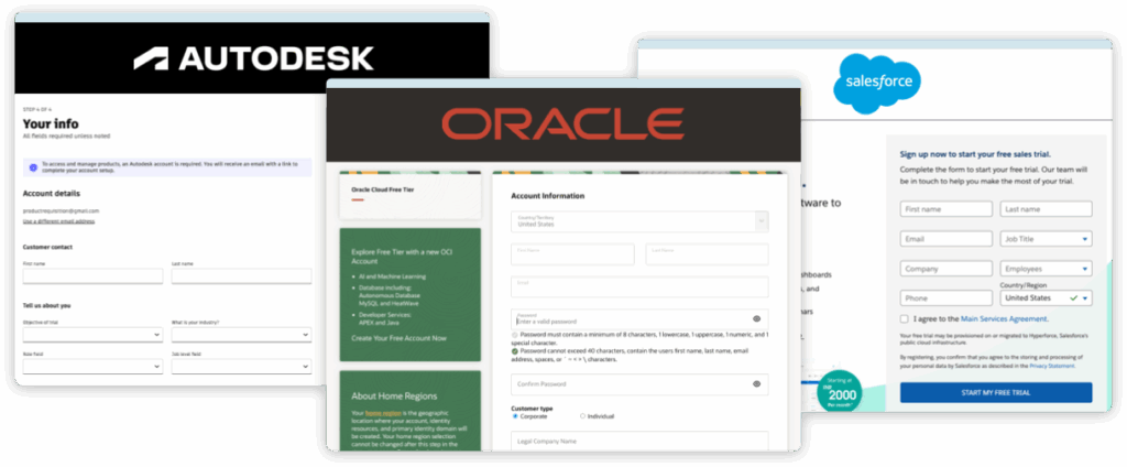
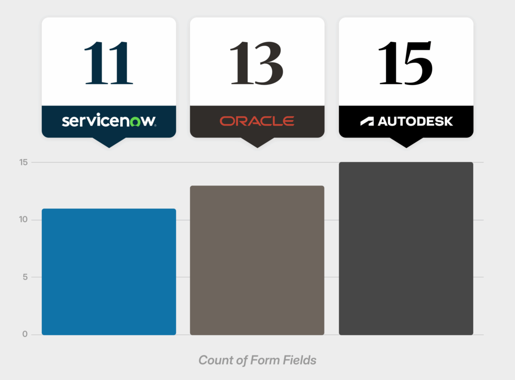
- Autodesk forces users through 15 fields just to access a trial — despite research showing that 27% of users abandon forms purely due to excessive length.
- Oracle isn’t far behind, requiring 13 fields, layered with unnecessary verification steps that only compound the frustration.
- ServiceNow? 11 fields before a prospect can even get started.
Companies leak millions in pipeline every quarter, not from targeting or content, but from the form itself.
The Mobile Multiplier Effect
On mobile, form friction doesn’t just add up. It compounds. With over 62% of global web traffic coming from mobile devices, friction rapidly escalates, driving abandonment:
- Slower, error-prone input: Mobile typing is slower and less accurate, increasing mistakes and user fatigue, especially with repetitive information entry.
- Limited visibility: Smaller screens mean constant scrolling, causing users to lose context and momentum, increasing abandonment.
- Greater distractions: Notifications and multitasking quickly drain attention, making users far less patient with friction-heavy forms.
Each extra field on mobile amplifies the effort required, dramatically increasing drop-offs. Consider solutions like single-column layouts, real-time validation, 1-Click SSO Signups, and auto-fill to streamline the experience.
Minor friction on desktop becomes a major obstacle on mobile. Optimize your forms with a mobile-first mindset to protect conversions.
Beyond Length: How Poor Timing Turns Warm Leads Cold
The data tells an expensive story: B2B forms aren’t just too long. They’re also asking the wrong questions at exactly the wrong time.
Take AppLovin’s signup form. After eight fields and asking for your password twice, users are hit with “How did you hear about us?” (a low-value question with zero relevance at the point of conversion).

Or consider Autodesk. After navigating through three pages of their signup flow, users are still required to provide their Trial Objective, Industry, “Role field,” and “Job level field” before gaining access. This isn’t just unnecessary friction. It’s misaligned incentives.
These companies prioritize data collection at the cost of user experience, asking for information that could easily wait until after signup. It’s like opening with “So, what’s your five-year plan?” on a first date — technically possible, but guaranteed to kill the vibe.

These misplaced asks contribute nothing at the moment of conversion. Worse, they demand information before value is delivered, violating a core principle of conversion: don’t ask for more than you’ve earned.
The result? Every unnecessary question compounds the Complexity Tax, making it more likely that even high-intent prospects will abandon the process entirely. These aren’t cold leads. They’re qualified prospects hitting a wall of friction, turning potential revenue into lost opportunities.

The good news? This leak is fixable. With smarter sequencing and a user-first mindset, companies can dramatically reduce form friction while simultaneously improving data quality.
The ask isn’t the problem — it’s the timing. Front-load friction, and even your best prospects bounce.
3. The Fix: Smarter Forms, Not Just Shorter Ones
Yes, shortening forms generally leads to better conversions — but length alone isn’t the villain. The real problem is when forms lead with complexity, turning curiosity into resistance.
This is precisely where the most common objection surfaces: “But we need long forms to qualify leads.”
However, most companies aren’t overqualifying — they’re overasking. When the full gauntlet of firmographic questions is presented before any value is delivered, you’re not filtering for intent — you’re forfeiting it.
Smarter forms don’t skip important data. They earn it. And that starts with understanding where friction belongs (and where it doesn’t).
And it’s worth noting that form length shouldn’t be conflated with form complexity. Even a short form can create real friction if its fields demand too much effort or attention. Some inputs simply carry more cognitive load than others — a concept we’ll explore more deeply in our upcoming Complexity Tax breakdown on field types.
But smart design isn’t just about reducing friction. It’s also about preserving relevance. Cutting fields might boost raw conversions, but if it leads to lower-quality leads and wasted sales effort, that’s not optimization. That’s just noise. There’s a difference between generating more leads and generating better ones. The best forms don’t just increase volume. They improve outcomes.
The solution isn’t about removing fields arbitrarily. It’s about restructuring data collection and leveraging the right tools to balance user experience and lead quality.
The goal isn’t a shorter form at all costs — it’s a smarter one that respects user intent and drives better outcomes.
What the Research Says About Form Design
If overasking is the problem, friction is the price. The more fields you stack up front, the harder each one has to work to justify itself. And the research is clear. It’s not just long forms that drive abandonment. It’s poorly timed, high-effort ones.
Every extra input adds cognitive load, slows momentum, and increases drop-off risk. Which is why smart sequencing consistently outperforms form trimming alone.
📊 Emerging research confirms:
- Introducing fields later in the journey leads to higher conversion rates than front-loading unnecessary questions.
- Placing fields strategically improves completion rates more effectively than simply reducing the number of fields.
- Using one-click authentication (via Google, LinkedIn, or Facebook) — preferred by 77% of users — cuts form length and reduces perceived effort while maintaining data quality.
- Applying progressive disclosure removes early-stage friction without compromising lead accuracy.
There are exceptions to the “shorter is better” rule. Research from platforms like Unbounce reveals that while conversions typically dip as field count increases, they can rebound or even improve when forms serve a clear, high-value purpose. In fact, some longer forms saw better performance than their shorter counterparts, especially when users understood that more input meant a more personalized or useful experience.
Smart forms don’t just reduce friction — they earn trust, respect user intent, and align complexity with perceived value.
Addressing Form Optimization Myths
Two misconceptions keep complex forms in place:
“But our B2B users expect long forms.”
Yes, but expectation ≠ preference. Just because prospects are used to friction doesn’t mean it’s helping you convert. Familiarity with form bloat often leads to fatigue, not engagement.
When your process feels smoother than expected, it doesn’t lower perceived value — instead, it raises trust. It tells the user: “We respect your time.” And that’s a competitive advantage.
Of course, not all friction is accidental. Some of it is by design.
“But friction helps us qualify better leads.”
Other teams lean into friction on purpose, hoping added effort will self-qualify stronger leads. But forced friction is a blunt instrument. It doesn’t screen for quality — it filters for patience.
High-value prospects don’t abandon because they’re unqualified. They leave because your form is doing too much, too soon. If you want better lead quality, focus on smarter sequencing, not artificial barriers.
The strongest signal of intent isn’t how much friction a prospect tolerates — it’s how seamlessly you turn curiosity into commitment.
How to Lose Friction Without Losing Data
Instead of forcing users through a long, high-friction sign-up process, leading companies are shifting to conversion-friendly models:
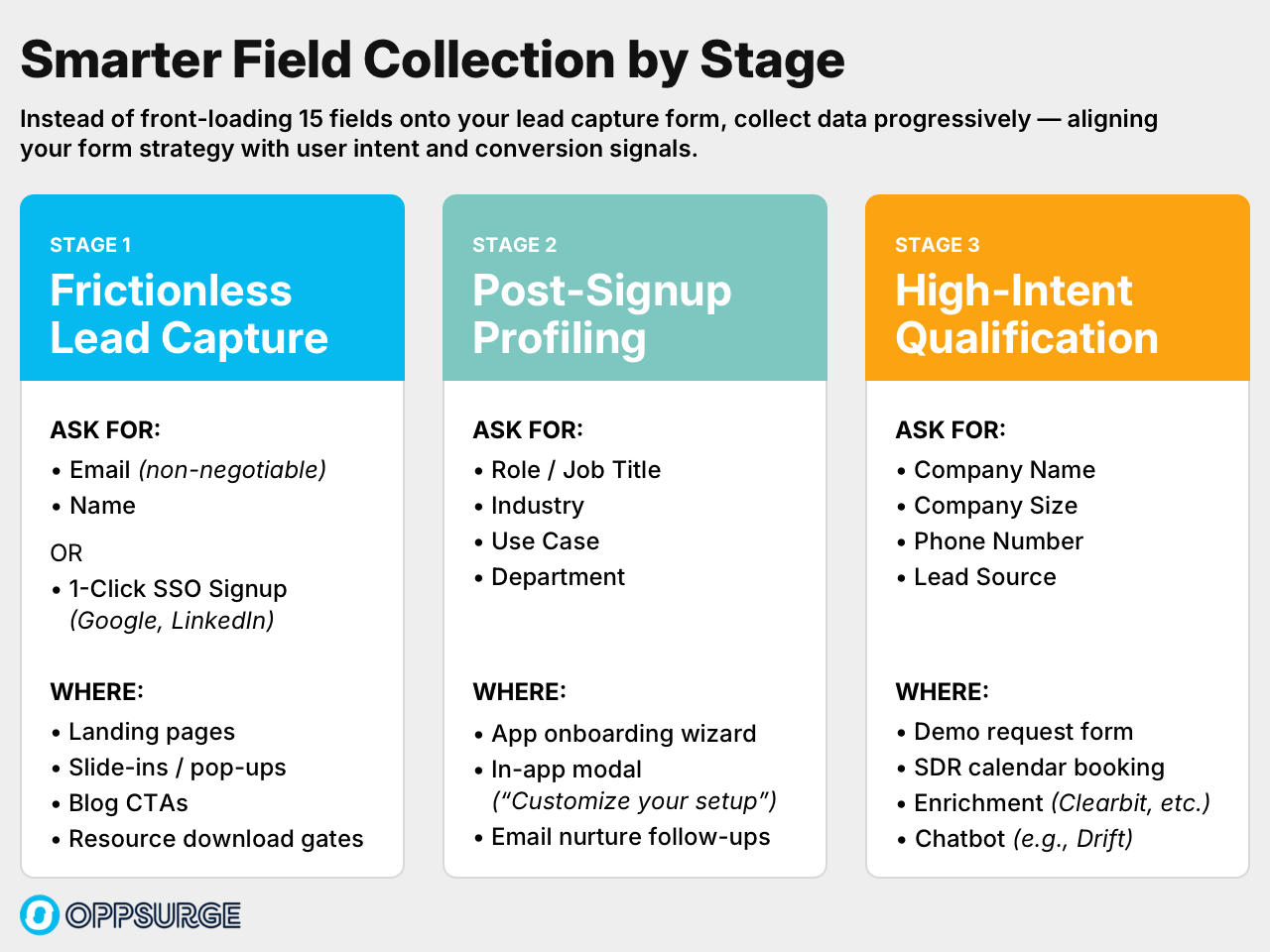
✅ Sequence Strategically – Ask only for must-have details up front (e.g., name, email). Push non-essential fields like phone or company size to later touchpoints (e.g., onboarding, calendar booking, or follow-up), when users are more engaged and drop-off risk is lower. Progressive profiling can help you collect richer data incrementally, without front-loading friction.
✅ Implement Social Signups – Reduce friction by letting users auto-fill key fields (name, email, company) with one-click authentication. Have your dev team build a custom Google One-Tap integration, or use a no-code solution to add one-click signups directly into your forms.
✅ Leverage Enrichment Tools – Instead of asking for every firmographic detail up front, use data enrichment platforms to populate fields like company size, industry, and job role behind the scenes. Enrichment Tools like Clearbit help reduce form friction while still providing critical data for lead scoring, routing, and segmentation, which is especially useful in demo requests or SDR workflows.
✅ A/B Test with Your Actual Audience – Best practices and aggregate studies are a starting point, not a system to fly on autopilot. To improve performance, test field counts, layouts, and sequencing — not to chase abstract conversion lift, but to uncover what actually drives results for your audience and your offer. Real optimization comes from your own data.
How Leading Brands Are Getting It Right
Not every enterprise form is a conversion killer. The best teams are winning with focused flows that balance friction and qualification — strategically.
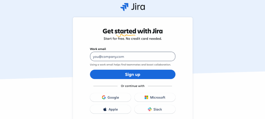
Atlassian’s Jira signup gets it right: just four essential fields — work email, verification code, full name, and password — delivered through a clean, multi-step flow. We’ll break down why multi-step forms work so well in a future Complexity Tax entry, but for now, the takeaway is simple: clarity converts.
Their one-click SSO signup via Google, Microsoft and others, pulls triple duty: cutting abandonment, eliminating password friction, and capturing cleaner data at the point of entry.
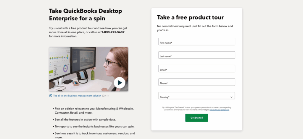
QuickBooks Desktop Enterprise shows similar discipline: five fields — first name, last name, email, phone, country. No bloat. Just what’s needed to qualify interest and route leads without slowing them down.
Fewer fields. Smarter sequencing. Strategic SSO. This is how modern SaaS companies earn conversions, not obstruct them.
The Bottom Line: The True Cost of Form Friction
Across industries, the data is clear: form complexity directly undermines marketing ROI.
- 35% Higher Conversions with One Less Field: A HubSpot study of 40,000 landing pages found that reducing forms from 4 to 3 fields increased conversions by 35% — a small change that can dramatically lower CAC without spending an extra dollar on acquisition.
- $4,000+ in Wasted Spend for Every Extra Field: After five fields, each additional field reduces conversions by 6.7% on average. For teams investing $50K/month in paid programs, that’s over $4,000 in lost pipeline per unnecessary field.
- 50% Pipeline Loss with Long Forms: Forms with 10 or more fields see abandonment rates double. Every extra question compounds friction, cutting pipeline efficiency in half and inflating cost-per-lead.
Yet despite overwhelming evidence, Fortune 1000 companies continue to impose this Complexity Tax, silently draining millions in lost opportunities and wasted marketing spend.
Friction doesn’t just hurt conversions now — it compounds pipeline leakage for quarters to come.
4. Conclusion: Eliminate Form Friction and Reclaim Lost Revenue
The evidence is clear: forms with 10+ fields see abandonment rates double, transforming what felt like harmless data collection into a conversion-killing choke point costing enterprises millions annually.
What makes this problem so frustrating is how fixable it is. The companies getting this right aren’t making radical changes. They’re simply creating flows that feel more like conversations than interrogations.
By front-loading only essential fields, enabling social signups, and deferring low-priority questions, top teams are boosting conversions without sacrificing data quality.
As you review your own forms, ask not just what you’re requesting, but when. Is that question truly essential at first touch? Could it wait?
Remember: the cost of friction isn’t just lost conversions — it’s lost context, misaligned follow-ups, and wasted sales cycles.
The Complexity Tax: operationally invisible, internally rationalized, and quietly bleeding revenue from your funnel.
What’s Next: The Field Types Costing You the Most Revenue
Not all form fields create equal friction. In our next post, we’ll reveal which specific field types cause the highest abandonment rates — and how to transform these conversion killers into pipeline builders without sacrificing valuable data collection.